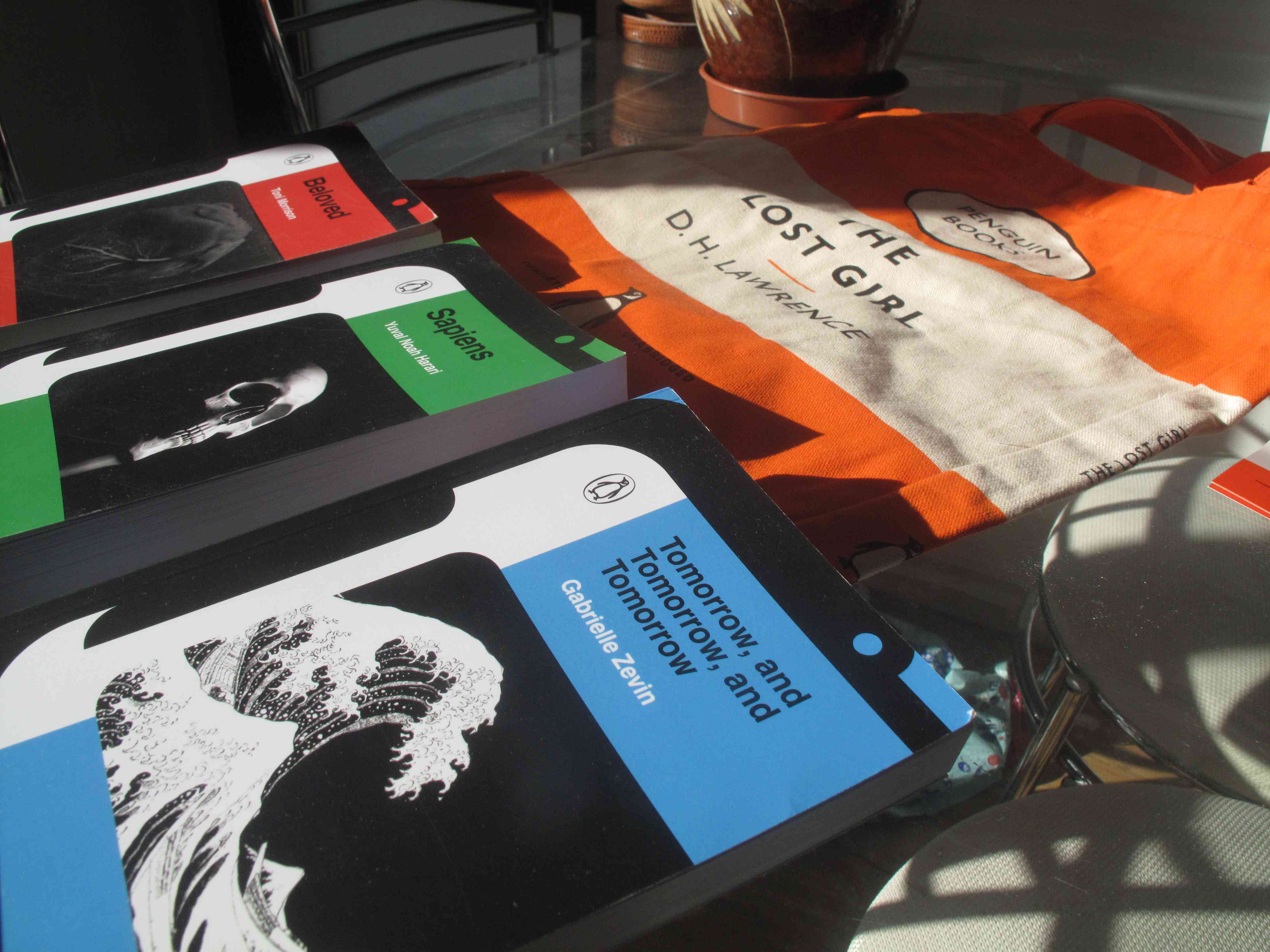
Penguin Cover Award
In late January 2025 I saw an Instagram ad for a competition being held by the publisher Penguin Books. The competition, held annually, sees entrants design the front cover for a book. This time, to mark their 90th year of publishing, Penguin changed the brief to a 'design system'—a cover that works for many books across different genres. This new brief particularly appealed to me, so I decided to enter.
The more I learn about design the more it seems axiomatic that trying many ideas is better than following your nose, but by the time I discovered the competition, its deadline was only a week away. I needed to be more direct. Skipping pen and paper, I laid some ideas down in Affinity Designer. The design had to be:
- Identifiably 'Penguin', taking inspiration from their historical designs.
- Original enough to warrant the hypothetical new book series, and avoid reliance on established design features.
- Accommodating to book-specific artwork or photographs. Unique imagery allows them to be identified without reading their titles.
- Conventionally 'good'—something which communicates what the book's called, who it's by, and who published it, in descending order of importance.
Though our submission would show the design used on three different books, I did all of my drafting with Gabrielle Zevin's Tomorrow, and Tomorrow, and Tomorrow. I had not read the book but it had been recommended to me, and Hokusai's Great Wave off Kanagawa, which features in the story and on its published cover, is a strong (and copyright-free) graphic.
I like geometric, colour-blocky designs, so that's where I started. I messed around with different fonts and arrangements of white-on-black-on-blue, but didn't accomplish much.
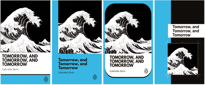
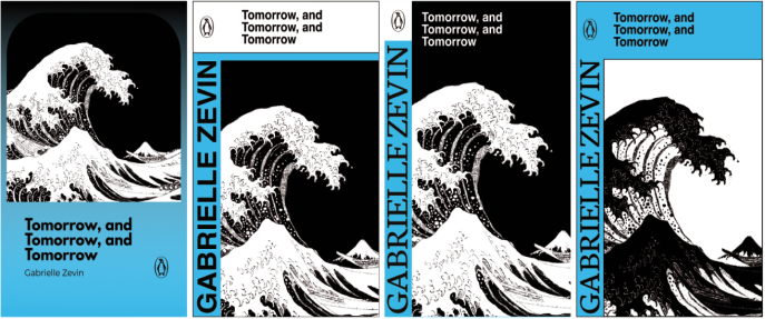
I shone my torch down a couple more tunnels before asking my brother, a certified idea geyser, what he thought of the brief. His first idea was to incorporate a penguin visual in the literal sense, which he demonstrated with a crop from a photo.
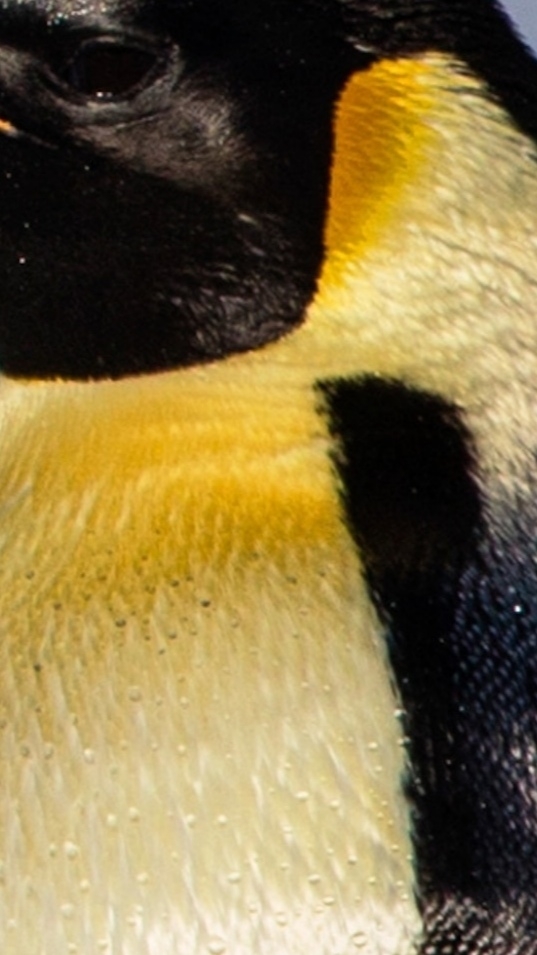
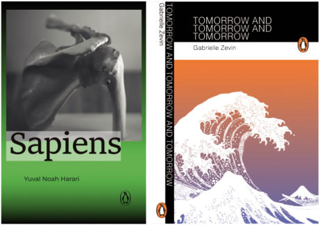
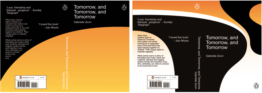
Under normal circumstances it might seem a little on-the-nose, but the idea is well-suited for an anniversary design. My brother also pointed out that gradients, which have seldom appeared in historical Penguin designs, could be a subtle way to suggest the animal's plumage. I gave it a couple of goes, but found it difficult to avoid the 'school textbook' feel while balancing the other factors.
I reversed out a little and came back in with a more graphical approach. I rendered the penguin instead as a graphical profile, framing the cover content. It took a few tries, but eventually I found a shape that worked as a penguin without drawing too much attention to itself. Mirroring it onto the rear cover bolstered the impression of a penguin when the book is standing alone and viewed from either side.
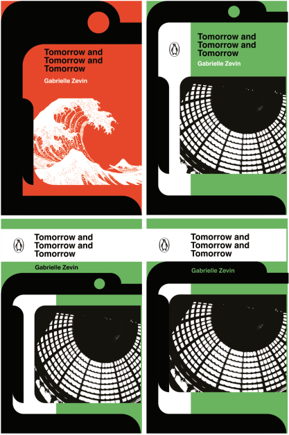
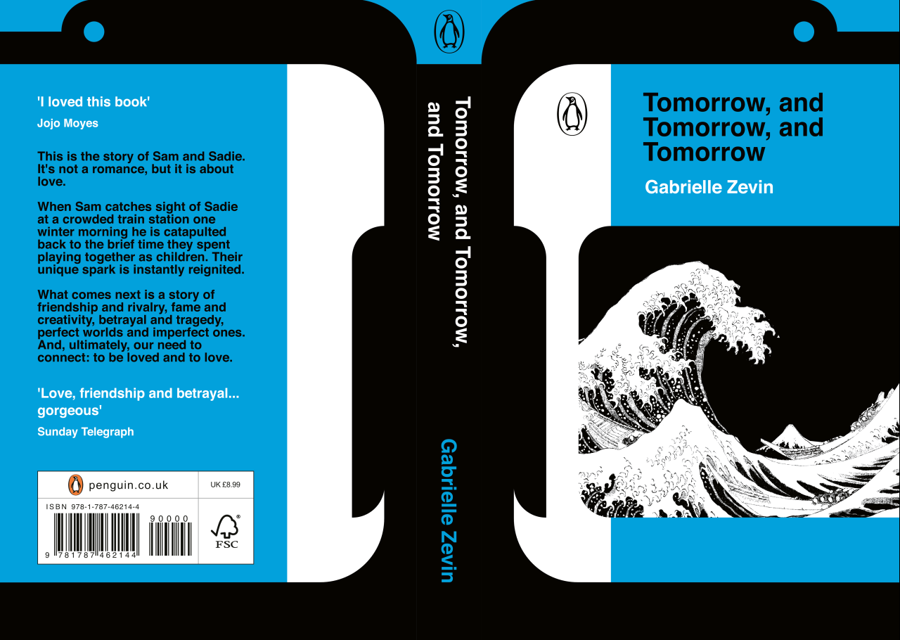
On the night of the deadline I was supposed to be at a pub quiz, which I was late for and then got cancelled anyway. More than a year later, I can't exactly remember what I was thinking, or how I expected my submission to fare. Even if the execution was a little rushed (the typography at least suffered), I knew that the design had a cuteness to it, and spoke to the brief in a way I expected many of the submissions not to. This fact, coupled with my dogged and slightly delusional self-belief, meant that I was not as pessimistic as I probably should have been. Realistically I didn't expect to win anything, but my competitive side would have been quietly disappointed if I lost.
In February I received an email informing me that my design had been shortlisted. I have only been so elated a handful of times before: once when I got my GCSE's (pathetic I know!), and again when I realised I had landed the job I am currently working. Because graphic design wasn't something I had done for several years or gone to university for, I viewed myself as a bit of an underdog, like I had swiped a spot I had no right to. This was silly because the competition explicitly does not allow professional graphic designers with more than two years of experience to enter, so I was mostly just up against people like myself.
Naturally I spent plenty of time looking at the other shortlisted designs and speculating on where I was likely to place. Consensus between me and my friends/family was that my design was almost certainly not the best, but also probably not the worst. In my head, I was hoping to come third, and if I didn't I would have told myself I came fourth.
In May I received an email informing me that I had come third. I haven't done any graphic design since.